Module 5: Filters and Slicers
Text boxes, shapes, images
You can just give some instructions...sure...
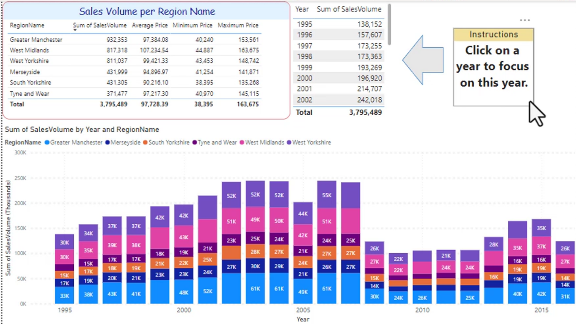
Shapes
Take a moment to resize and look at all of the options for shapes. This is useful when designing polished reports, dashboards, or callout panels.
Common shape options include:
- Rotation
- Edge
- Border
- Color
Shapes can be used to highlight KPIs, separate sections, or add visual emphasis without changing the underlying data.
Images
You can insert images and resize them as well. This is great for:
- Logos
- Branded graphics
- Product photos
- Icons or callout visuals
Images can also be used as clickable hyperlinks, making them a nice way to add navigation to a report or external resources.
Filters
Filters are one of the easiest ways to narrow the data shown in a visual, page, or entire report.
Visual-level filters
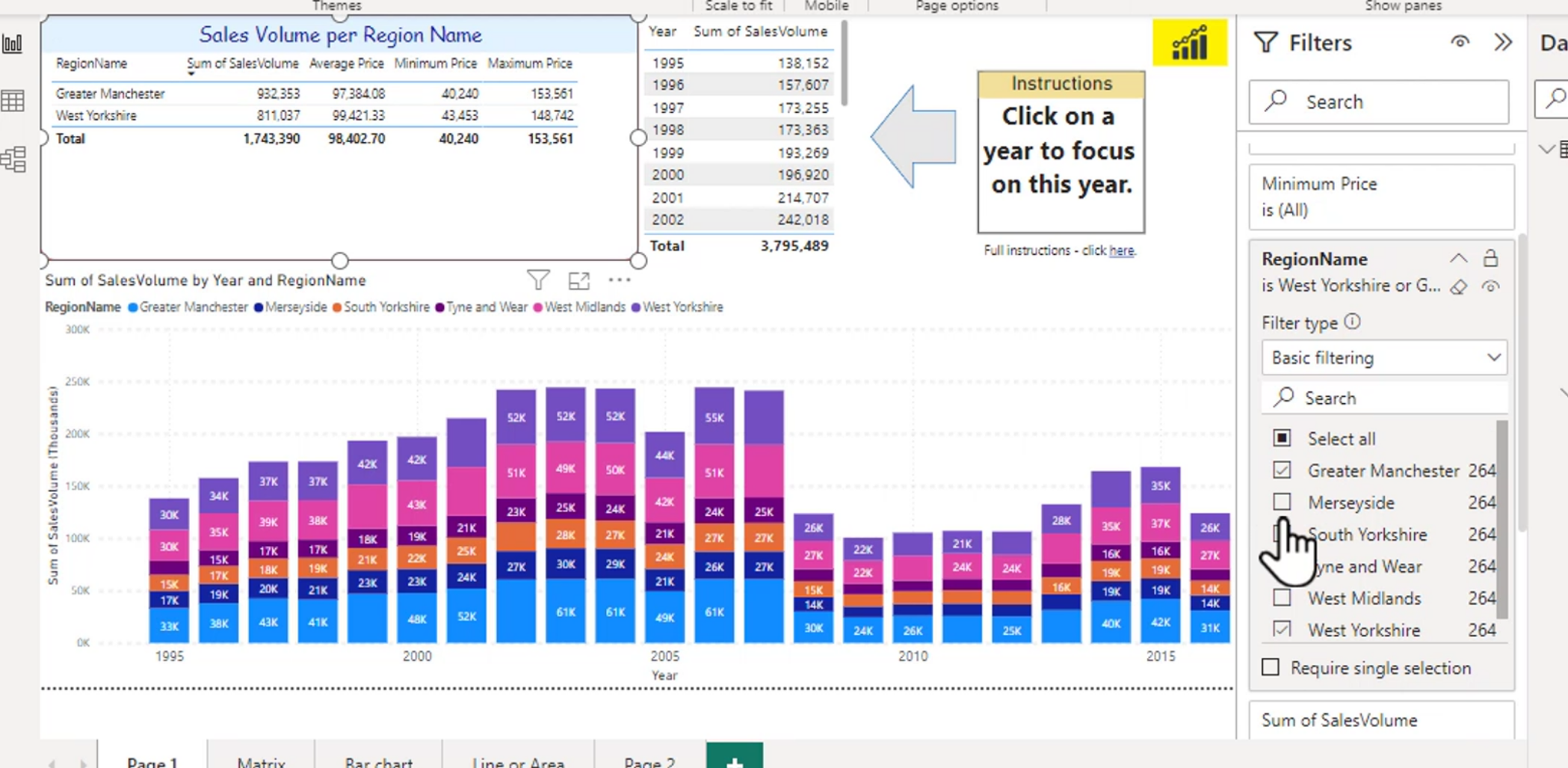
If you select a visual, you can filter on just that visual. This is useful when you want one chart or table to focus on a subset of data while leaving the rest of the report unchanged.
For example, the upper-left chart might only show Manchester and West Yorkshire, while the lower graph still shows all regions. This difference is helpful when comparing a filtered view against the full dataset.
Page-level filters
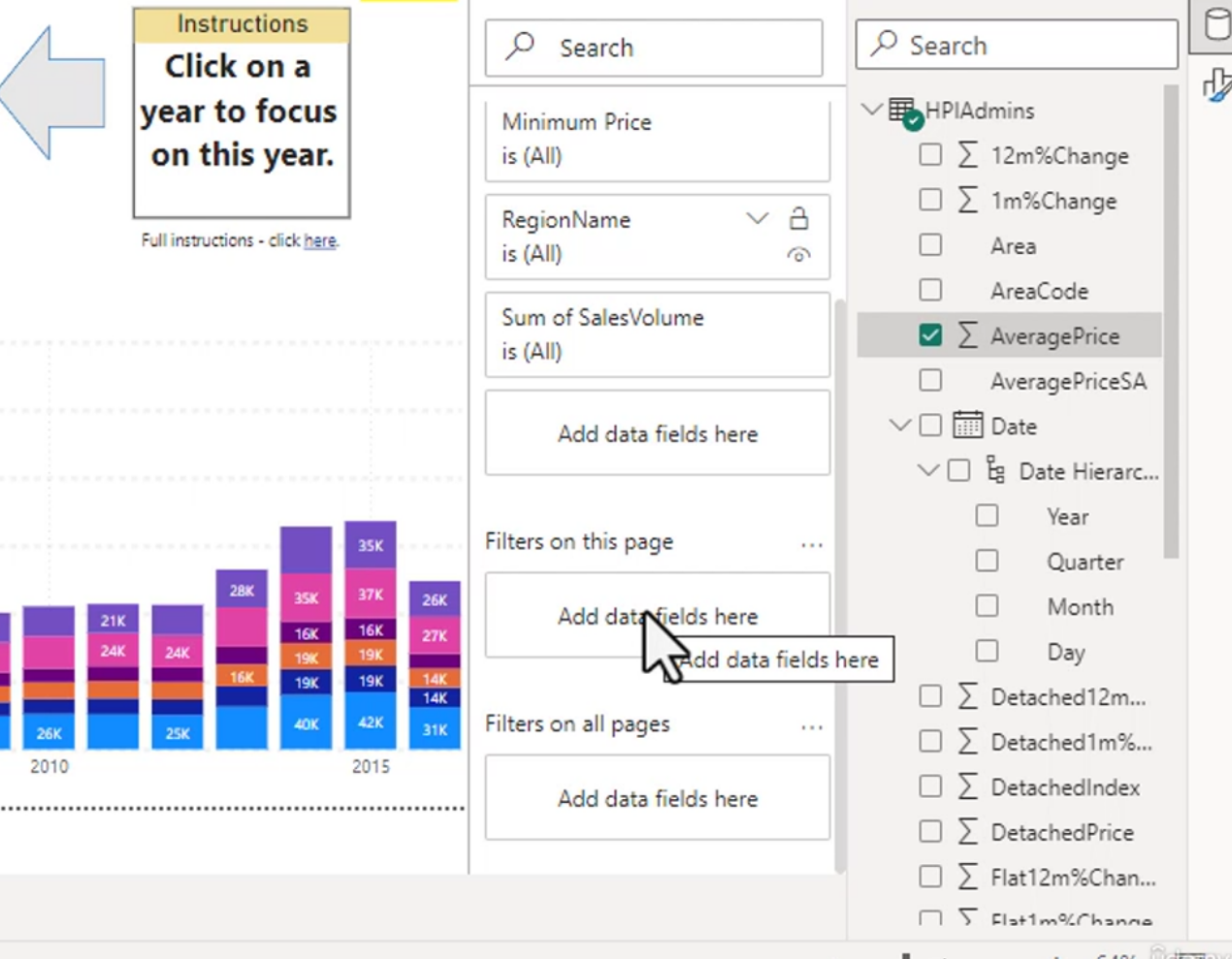
Use the "Filters on this page" pane when you want the filter to affect all visuals on a single page.
This is often the best choice for a dashboard page that has a particular business purpose or audience.
Report-level filters
You can also use "Filters on all pages" to filter data across the entire report. This is a broader scope than a page filter, but it is still usually better to filter the data before it gets into the report if possible.
In Power BI, it is generally better to clean or shape the data upstream in Power Query or the source system instead of filtering it out after it has already entered the model.
Tips:
- Selecting none usually does not make sense, because it effectively removes the filter and can create confusion.
- The eraser removes the filter.
- Filters can be applied in different scopes: visual, page, or report.
You get 3 filter options:
- Basic Filtering
- Advanced Filtering
- TopN
Advanced Filtering
Advanced filtering gives you more control than basic single-value filtering. This is useful when you need more flexible rules, such as excluding a set of categories or matching a pattern.
For example, you might filter to anything that does not contain "West" or use a rule that excludes specific regions that might appear later in the data source.
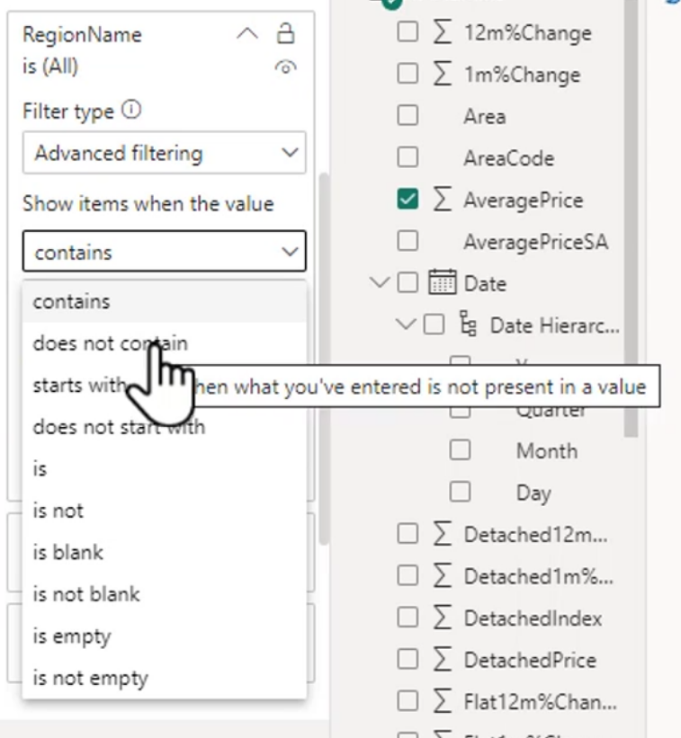
This is particularly helpful when your dataset might grow or when new region names get added in the future.
Examples:
- Date greater than 2003 and less than 2009 for a middle range of years
- Text filter that matches values such as West, west, or similar pattern matches
Tip: You can use wildcards or pattern-like rules here. For example, "w?s" can match West but not Worst.
Another tip: Relative date filtering can be very powerful. It is great for dynamic reporting such as "last 30 days", "this year", or "YTD".
Filter TopN items
TopN filters are used to show the top or bottom N items in a result set. For example, you might want the top 2 product categories by revenue or the bottom 5 customers by sales.
Example with veggie sales:
- First month is Corn and Peas
- Second month is also Corn and Peas
- Third month is Peas and Carrots
If you filter to the top items and select Corn and Peas, you may never see Carrots because the selected top categories are dominating the result. This is a good reminder that TopN is based on ranking, not a manual selection of categories you want to preserve.
You can also do the bottom N items if needed.
Slicers
Slicers are visual filters that let users interact with the report by selecting values from a field. They are often easier to understand than filter panes because they appear directly on the page and can be used as a dashboard control.
Multiple slicers can be used together to filter different aspects of the data. A typical report might include:
- A date slicer
- A region slicer
- A sales volume slicer
This makes it easy to drill into the exact slice of data the user wants.
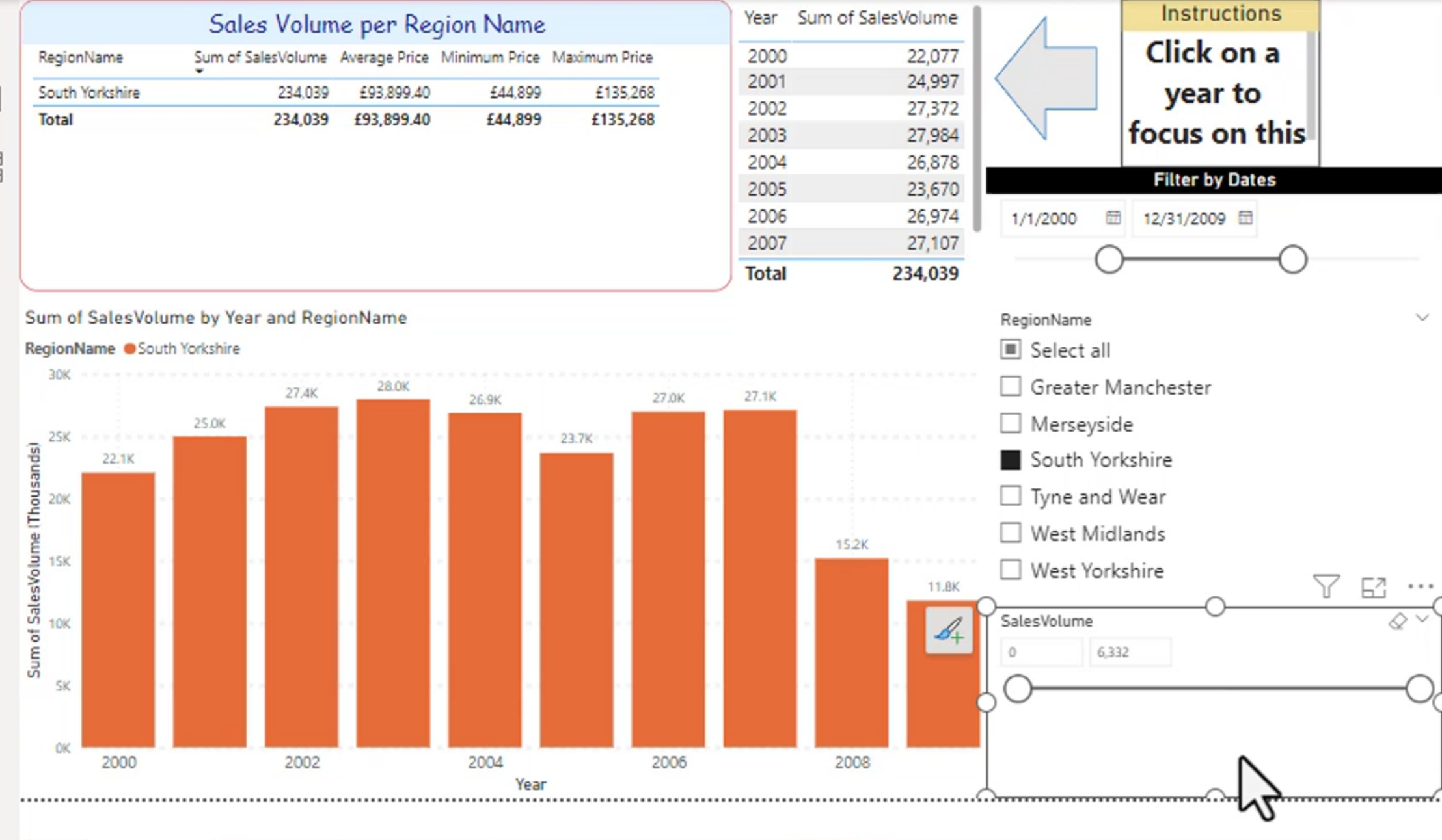
Steps to add a slicer:
- Drag a slicer visual onto the report page
- Add the field you want to filter on
- Format the slicer to match the report style and improve usability
Slicers are helpful because they make filtering feel more interactive and user-friendly than static filter panes.
Sync slicers to all pages
You can sync slicers across pages from the View tab.
This allows the same slicer selection to apply across multiple report pages, which is helpful for consistent user experience.
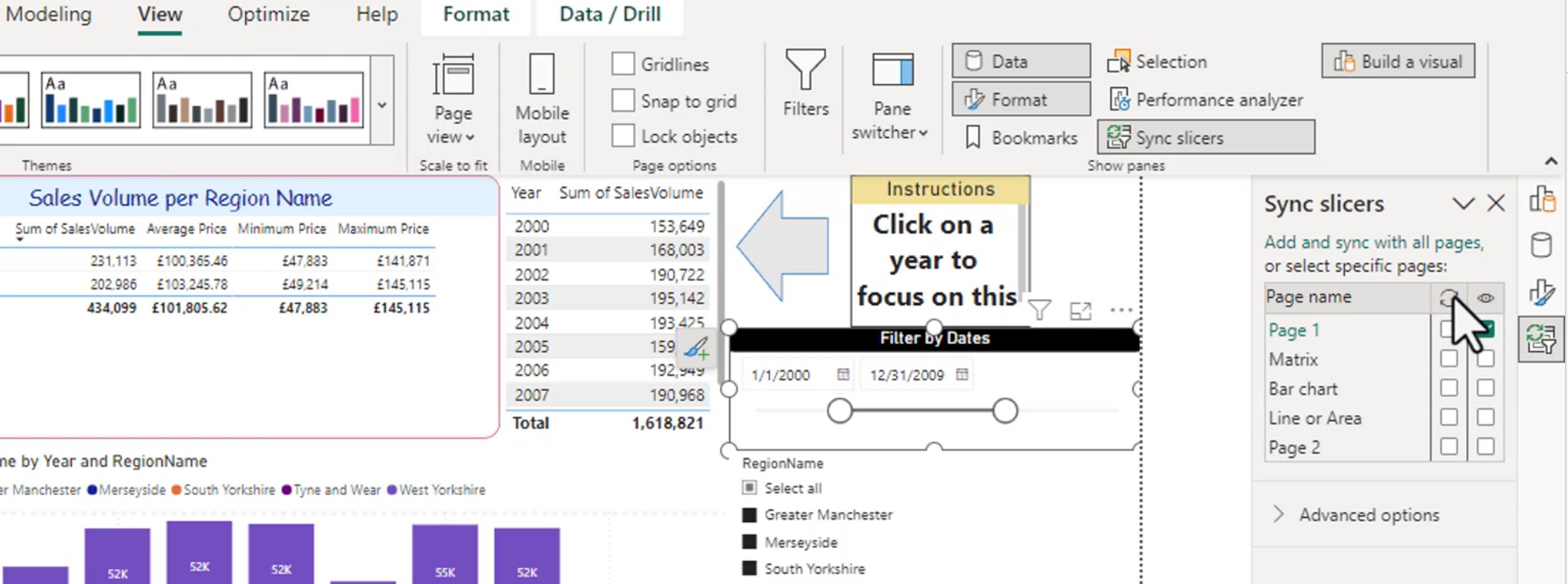
You can choose all pages or only a subset of pages.
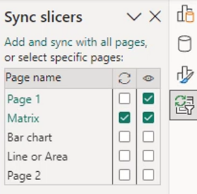
Important notes:
- Any new pages you add will need to be selected manually in the sync slicers settings.
- If you hide a slicer on one page, it may still affect all pages if the sync is active.
- Be careful when using synced slicers because they can create hidden filtering that users may not notice.
Slicer warnings
Deleting slicers can still affect the pages if they are synced or if filters are still active. This can cause confusion because users may think a selection is gone when the underlying slicer is still influencing the report.
Tip: Before deleting a slicer, make sure it is not active or synced.
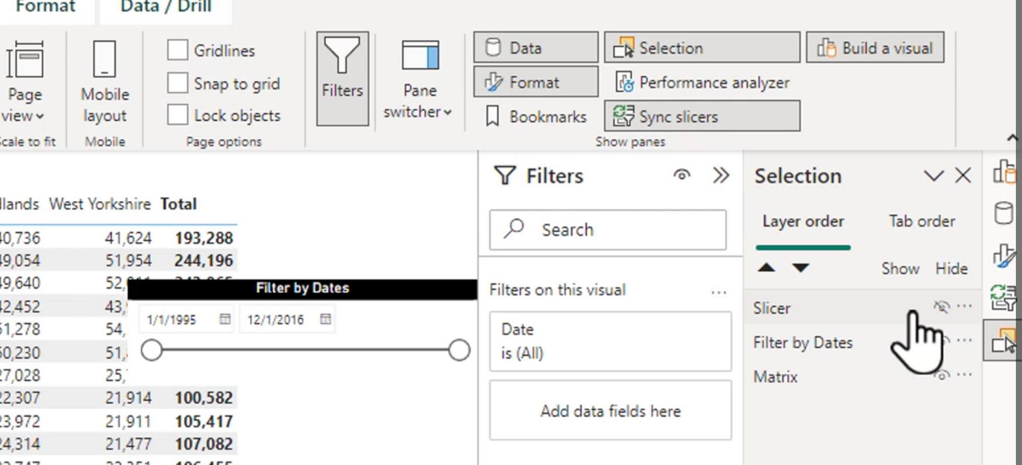
You can also use the Selection pane to reveal hidden slicers and manage visibility.
Selection may give access to slicers that are hidden from the page, which is useful for troubleshooting and design cleanup.
Button, text, and list slicers
There are several slicer visual types available, each with a different user experience.
Button slicer
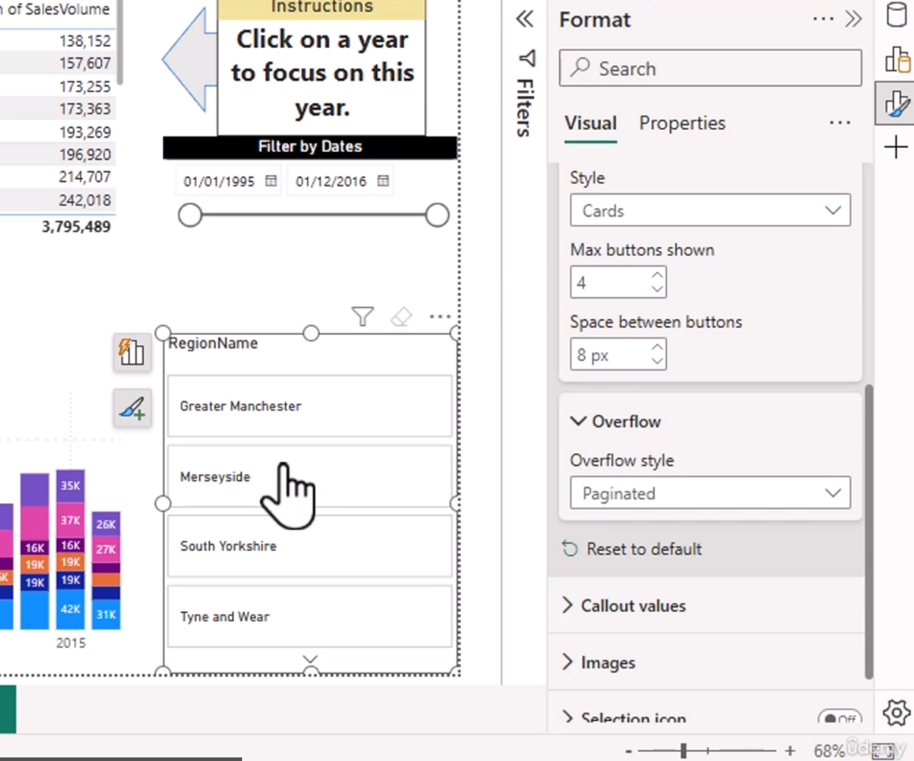
A button slicer presents values as buttons rather than a long list. This can be cleaner for smaller category sets.
Overflow options may include:
- Paginated
- Continuous Scroll
This affects how values are displayed when the list is long.
Text slicer
A text slicer allows users to search or type a value. This is useful for large lists or when someone wants to filter by name.
Example: typing "West" brings up all values containing "west" or matching that text pattern.
List slicer
A list slicer shows values as a list and can be styled for easier selection.
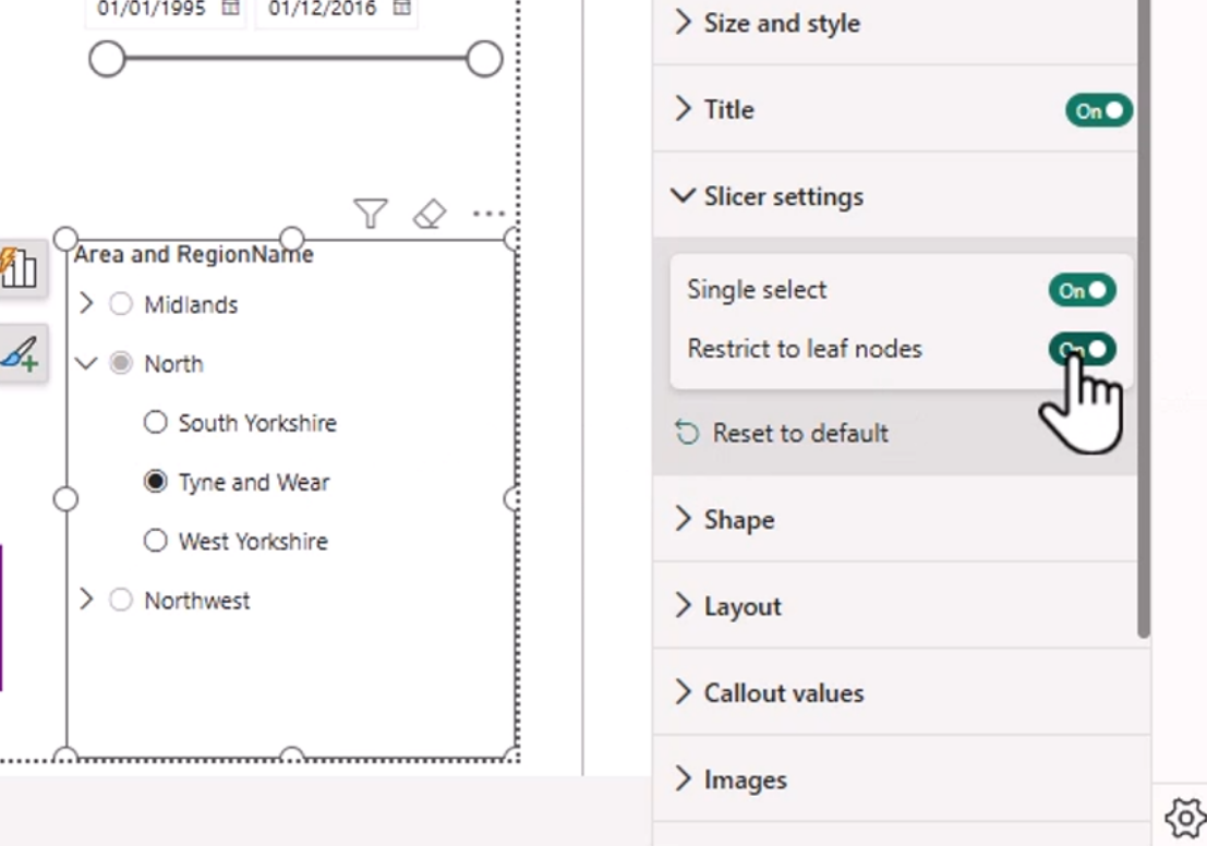
The "restrict to leaf nodes" option allows you to only select the children of a parent item rather than the parent category itself.
This is especially useful with hierarchical data.
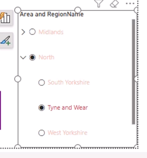
You can also highlight selections to improve readability and make it easier for users to see what is currently filtered.
Best practices
- Use the correct filter scope: visual, page, or report
- Avoid over-filtering data after it is loaded if the source can be cleaned earlier
- Use slicers for interactive user filtering and filter panes for more controlled report logic
- Be careful with synced slicers and hidden slicers
- Test selections to ensure report behavior is clear and intuitive