Module 3: Formatting our first visual
Power BI supports two ways to format a visual: On-object interaction and the traditional Format pane. On-object interaction places formatting controls directly around the selected visual, which can make common tasks faster.
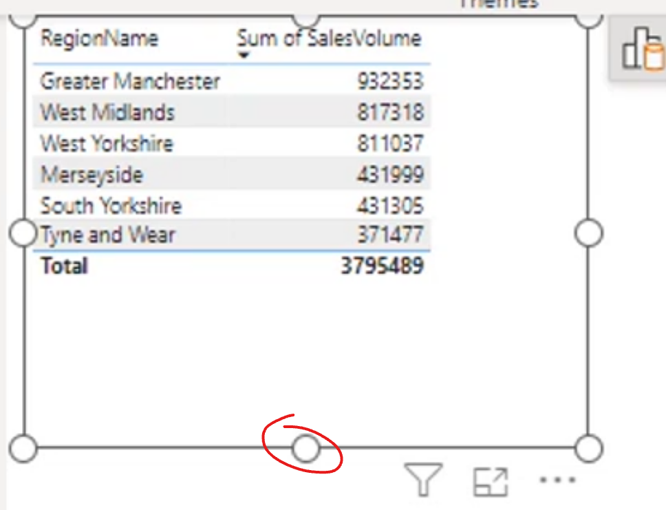
Note: You can use on-object interaction if you prefer it. Circular handles around the visual indicate that it is available:
Keeping Always show pane switcher enabled is useful because it makes it easier to move between the Build, Format, and Analytics panes without losing context.
Some formatting categories contain nested categories. Expand the parent category before looking for a specific option, such as a header, value, column, or grid setting.
There is a search box at the top of these panes. Use it to find a formatting property quickly, especially when working with visuals that have many configuration options.
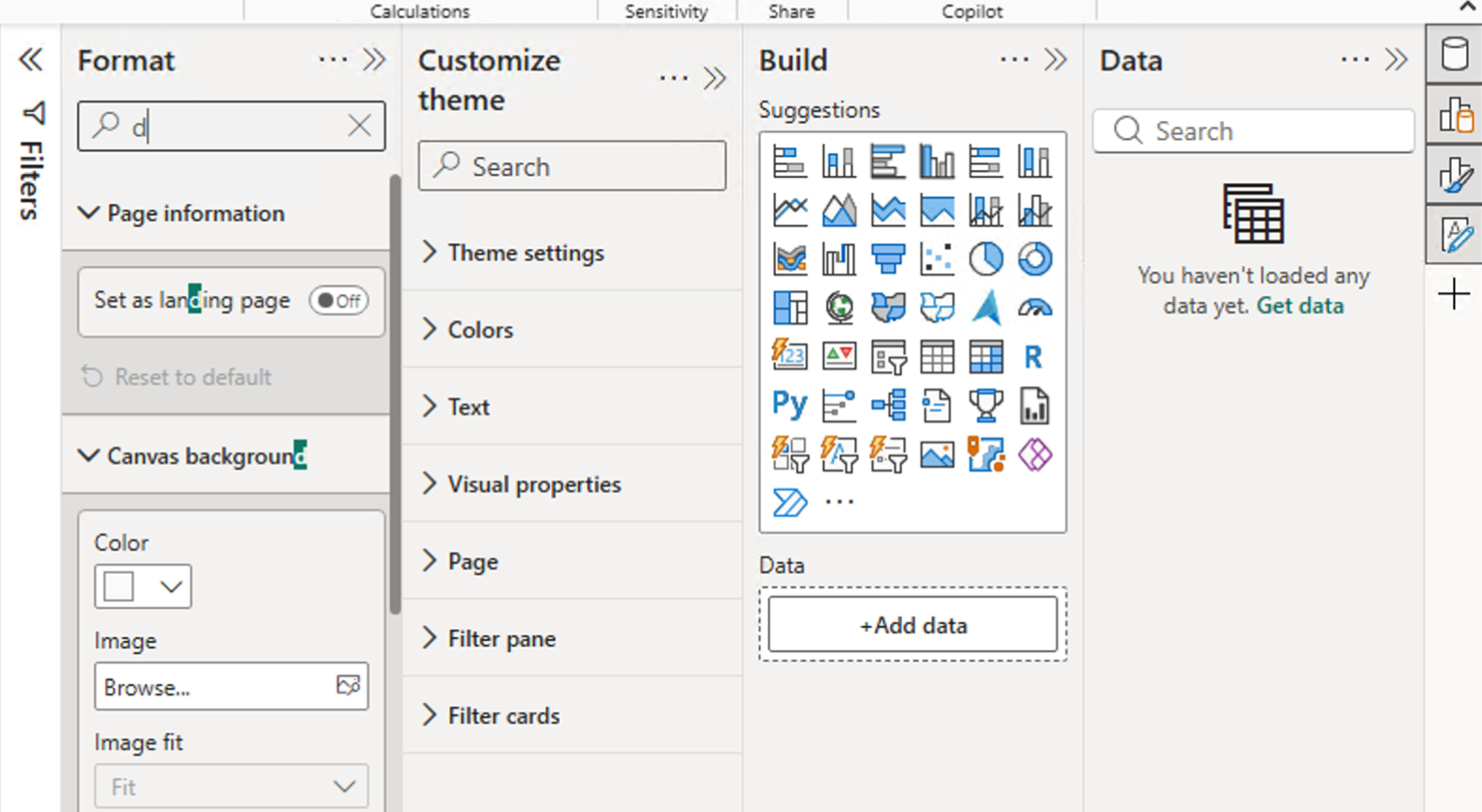
The three-dot menu lets you expand all categories, collapse all categories, or reset the visual's formatting to its default settings. Individual categories also include a reset option, which is helpful when you want to undo changes to one part of a visual without affecting the rest.
Format using On Object Interaction
Right-click a visual and choose Format, or select it and open the Format pane.
Notice the difference between square and circular handles:
- Circular handles: Use on-object interaction to resize or format from the visual itself.
- Square handles: Use the Format pane for more detailed formatting options.
You can also open a context menu from formatting options to access relevant settings more quickly:
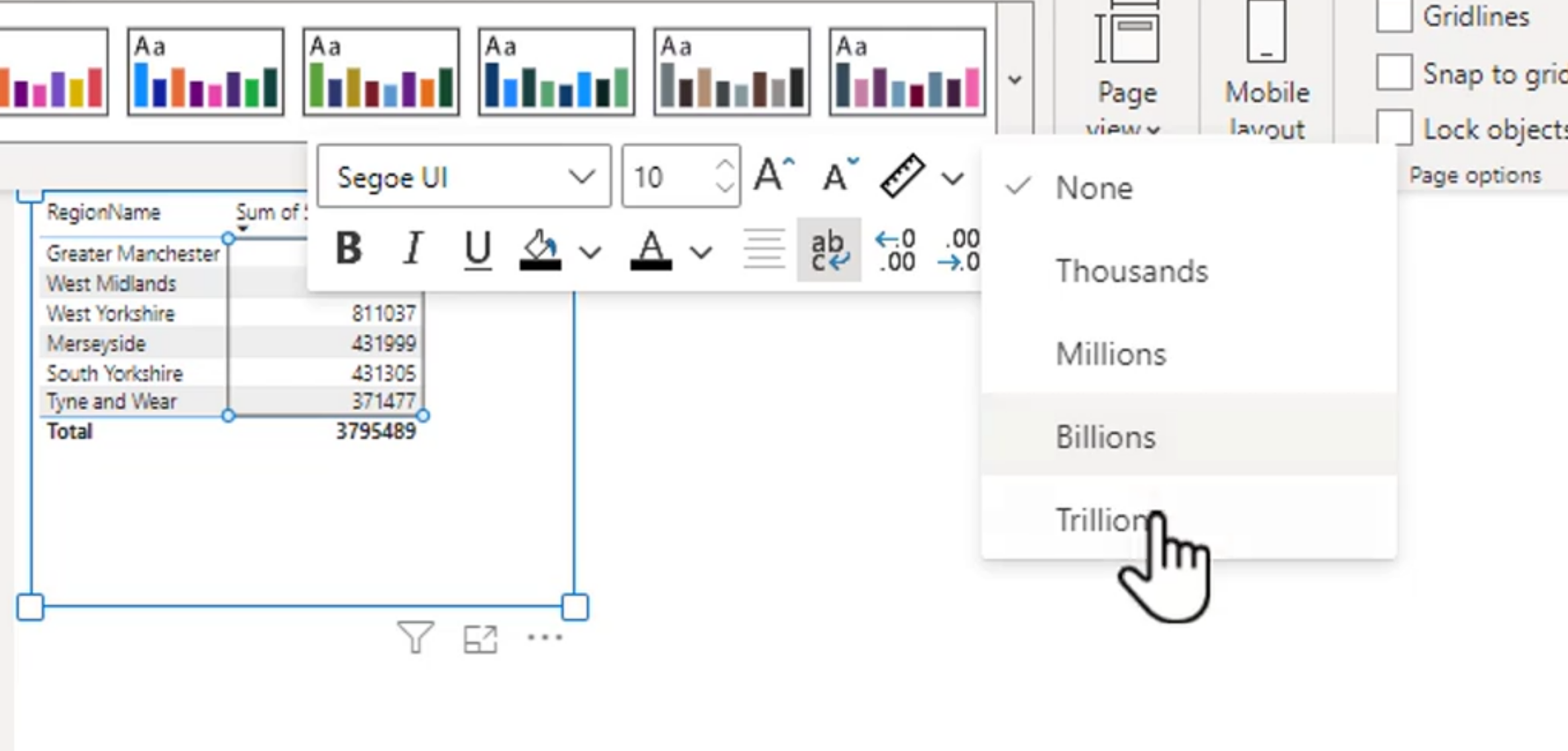
Formatting Font and Font Size
Undo reverses the most recent action, one step at a time. Reset to default restores a visual or formatting category to its original Power BI settings. Use Undo when experimenting; use Reset to default when a set of formatting changes needs to be removed.
Take note of the visual's Grid settings. The related sub-options are grouped under the main Grid category, including headers, values, columns, row padding, and gridlines. Adjusting these settings together helps create a consistent, readable table or matrix.
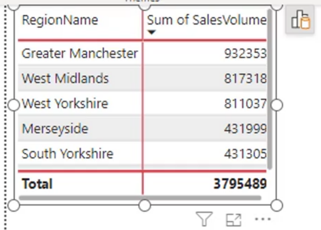
For borders, choose which sides to update: All, Top, Bottom, Left, or Right. This is useful for separating totals, emphasizing a header row, or reducing visual noise by removing unnecessary lines.
Formatting Colors
Use theme colors first so visuals remain consistent across the report. Power BI provides lighter and darker variations of each theme color, which can be used for hierarchy while keeping the report visually cohesive.
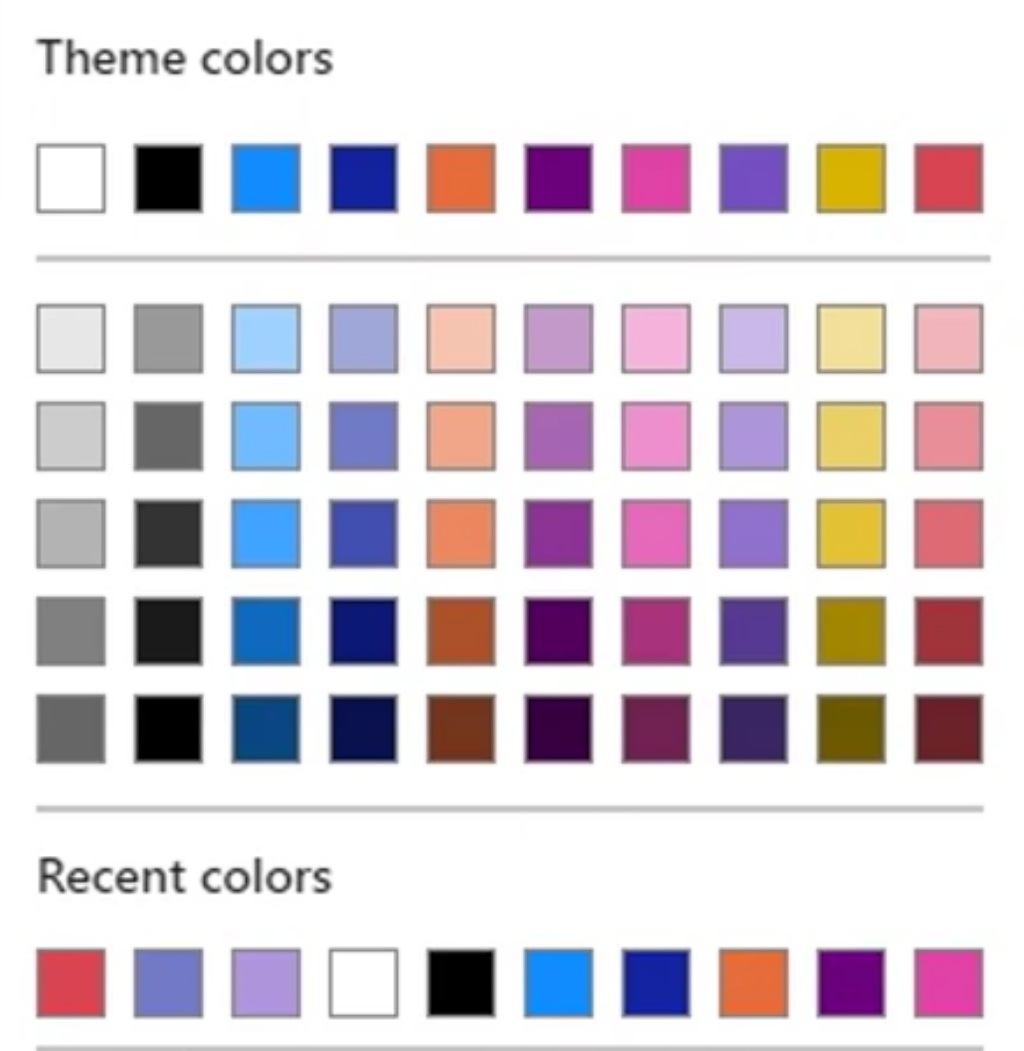
Hex colors represent red, green, and blue (RGB) values. Each pair ranges from 00 (none) to FF (maximum):
#FFFF00is red 255, green 255, and blue 0, which produces yellow.#000000is black;#FFFFFFis white.
Use exact hex values when a report must follow a defined brand or accessibility color palette.
Stylistic Options
Style presets are preconfigured combinations of formatting values. They provide a fast starting point, and each applied setting can still be customized afterward.
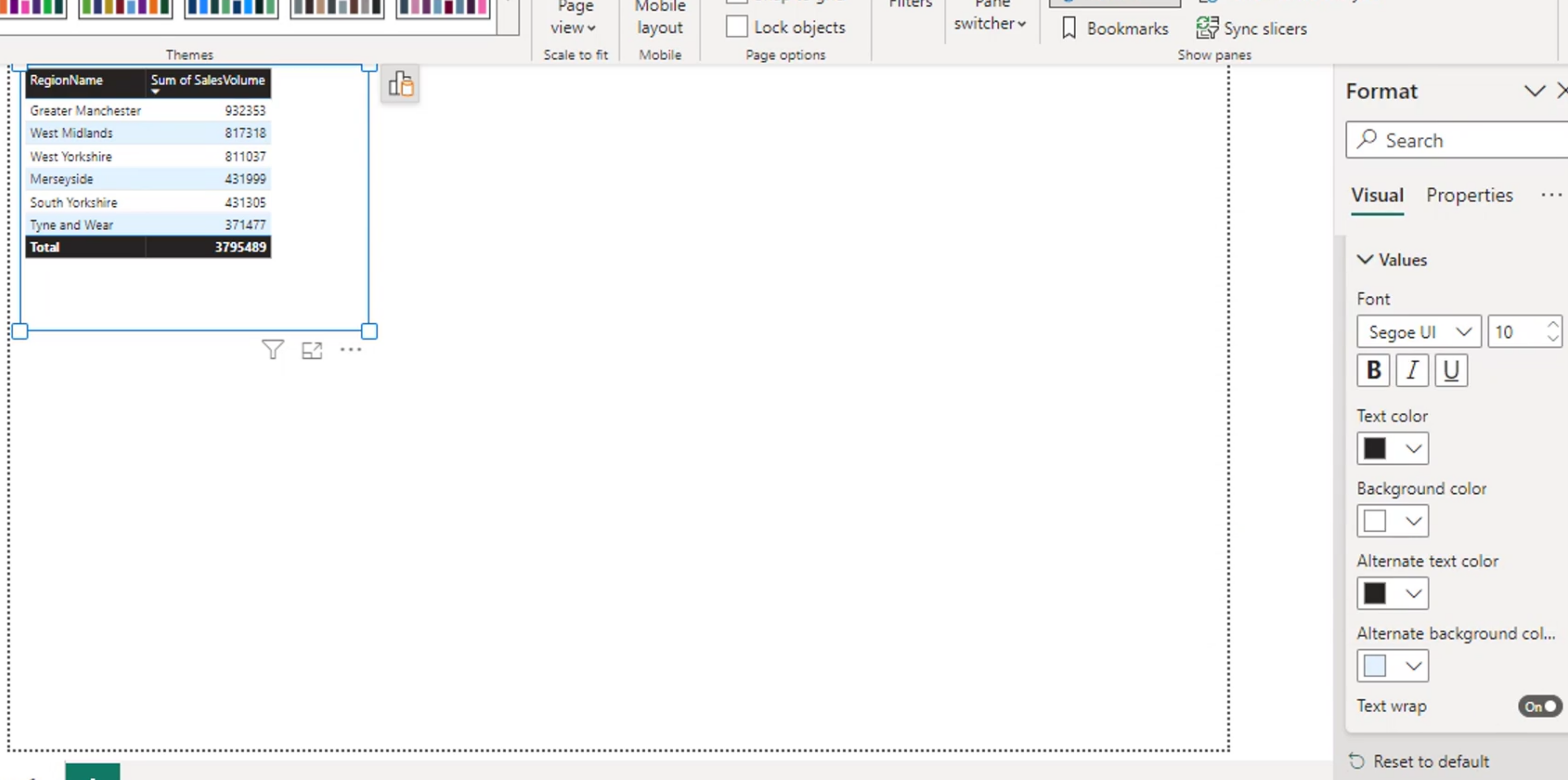
Start with a preset when it is close to the desired layout, then adjust individual options as needed.
- Title: Add a meaningful title that explains what the visual shows.
- Background: Use a subtle background only when it helps distinguish the visual from the report canvas.
- Visual borders: Use borders consistently to group related visuals without making the page feel crowded.
Positioning the visuals
In formatting mode, visual-level settings do not change column widths. Use the circular resize handles to resize the full visual, and use the visual's specific column-width controls when they are available. Dragging the circular handles preserves the on-object interaction workflow.
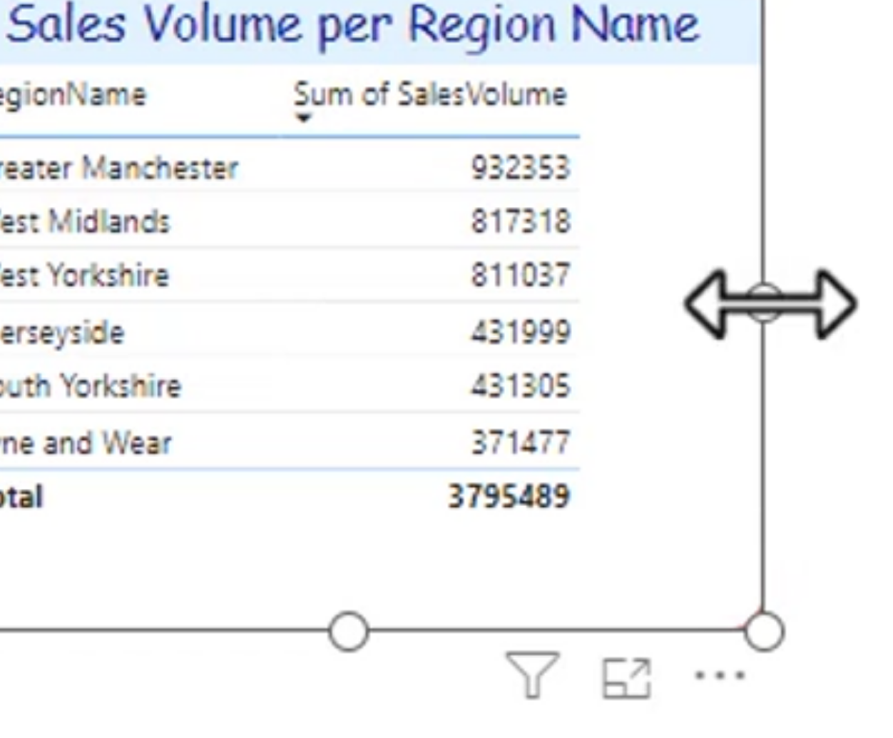
Move a visualization by selecting it and dragging it to the desired location. The pointer may not change to a hand, but click-and-drag still moves the selected visual.
For precise placement, enter the X and Y coordinates and the visual's width and height in the Format pane. This is especially useful when aligning multiple visuals or creating a repeatable report layout.
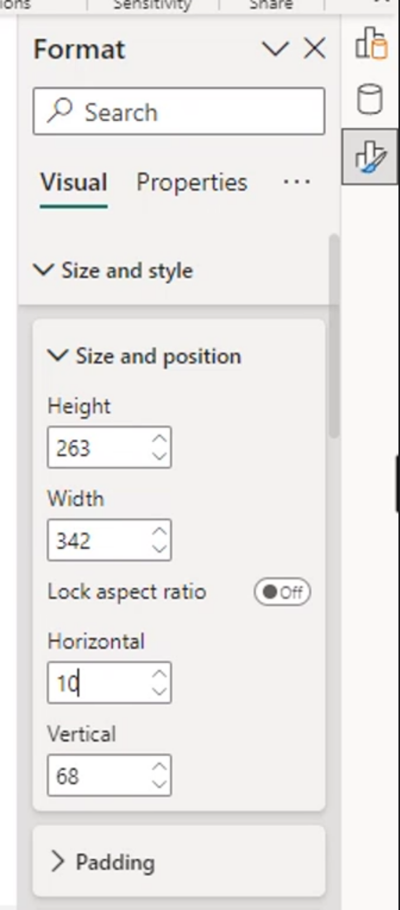
Alt text
Alt text makes a visual more accessible to people who use screen readers or text-to-speech tools. Describe the visual's purpose and its key insight, not every value. For example: "Monthly sales increased 12% from January to June."
Copy and Paste
You can copy an entire visualization and paste it to reuse its fields, formatting, and layout as a starting point. When positioning multiple visuals, red alignment guides appear to help line up edges and spacing. These guides make it easier to keep report pages consistent without manually entering coordinates for every visual.
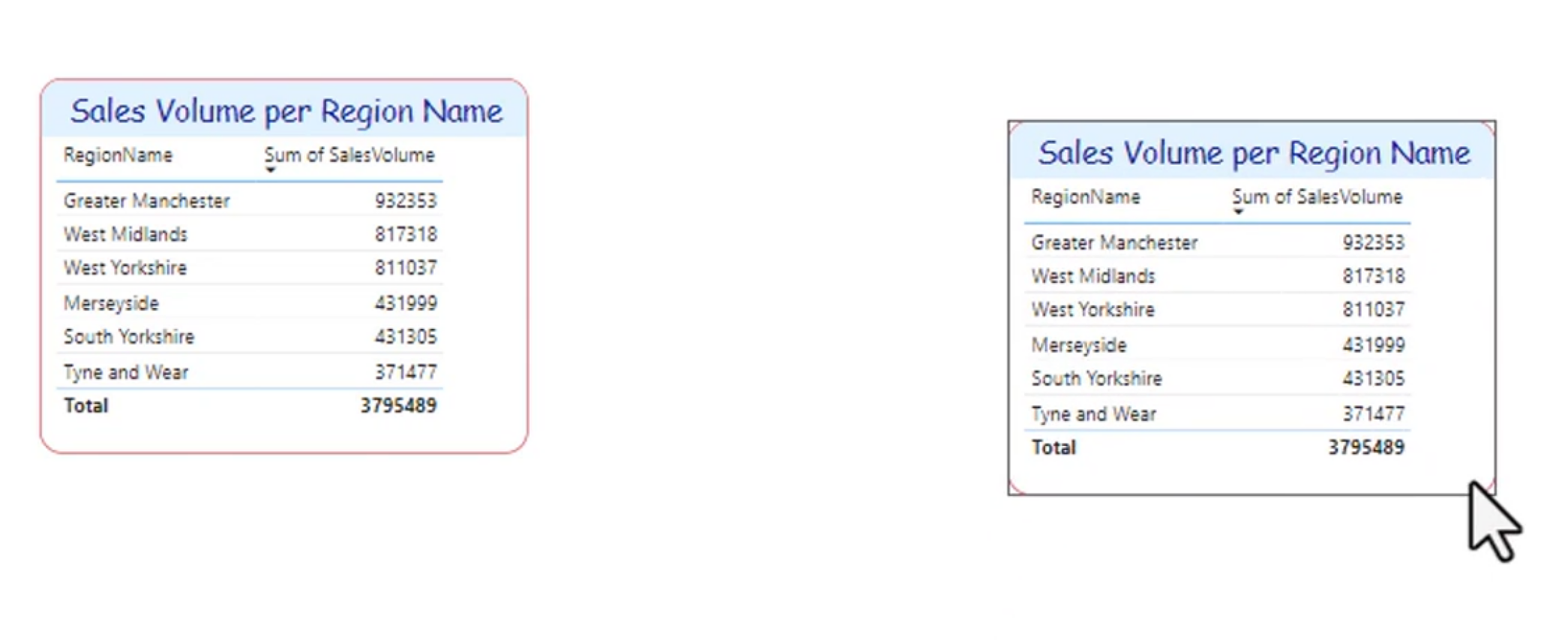
You can also overlap a visualization.
Aligning visuals
There is a handy Align button in the ribbon.
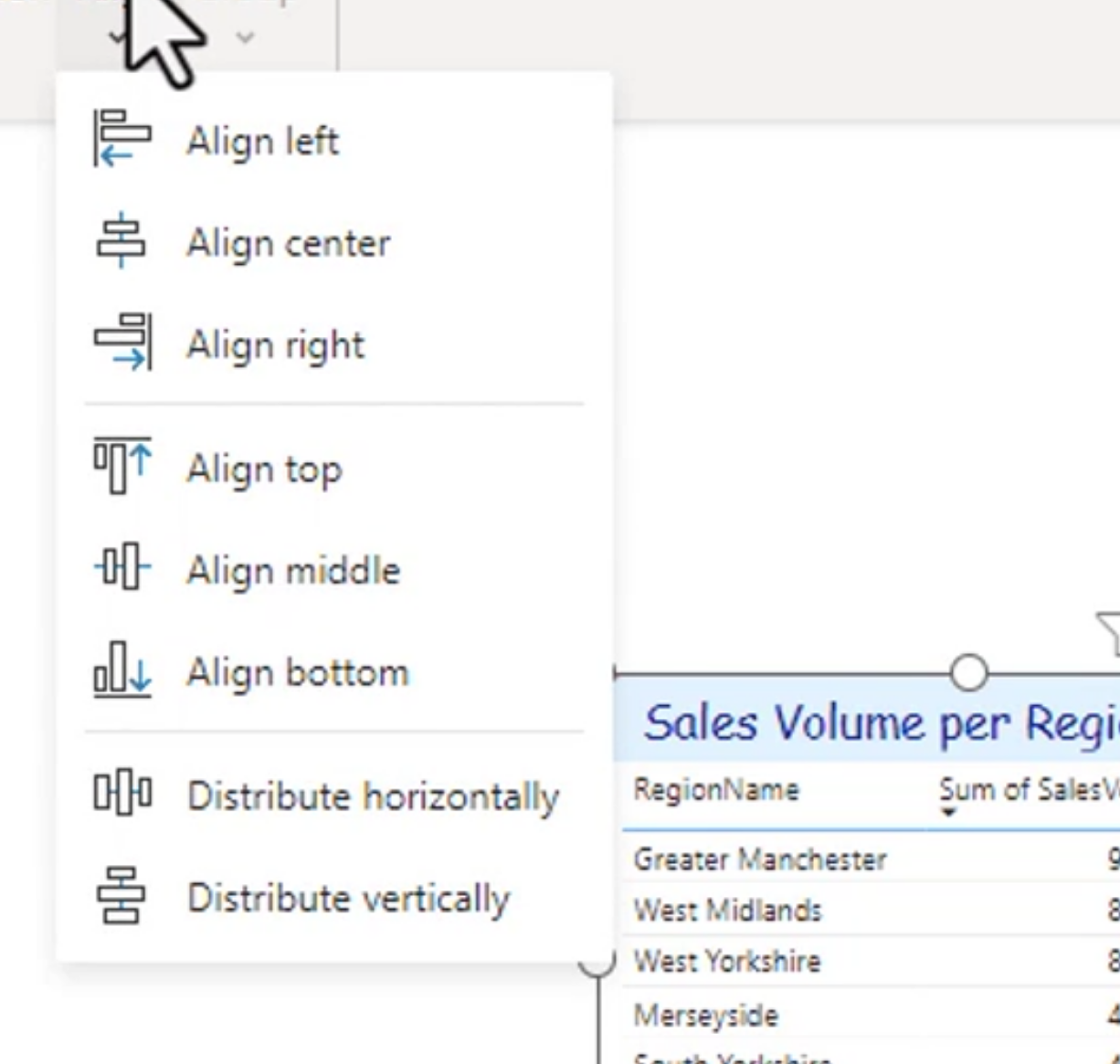
You can also align with the red lines, but if you select like 2 visualizations (drag a box or hold ctrl) you can align both.
Distribute horizontally and vertically
Bring forward or send backwards to stack your visuals accordingly. You can send all the way back or just one back.
Format Painter
Underutilized, but an excellent tool if you know how it works. Quick steps:
Configuring Summarization
WHen you click on build a visual, you can then change the aggregation of the numbers in that data field.
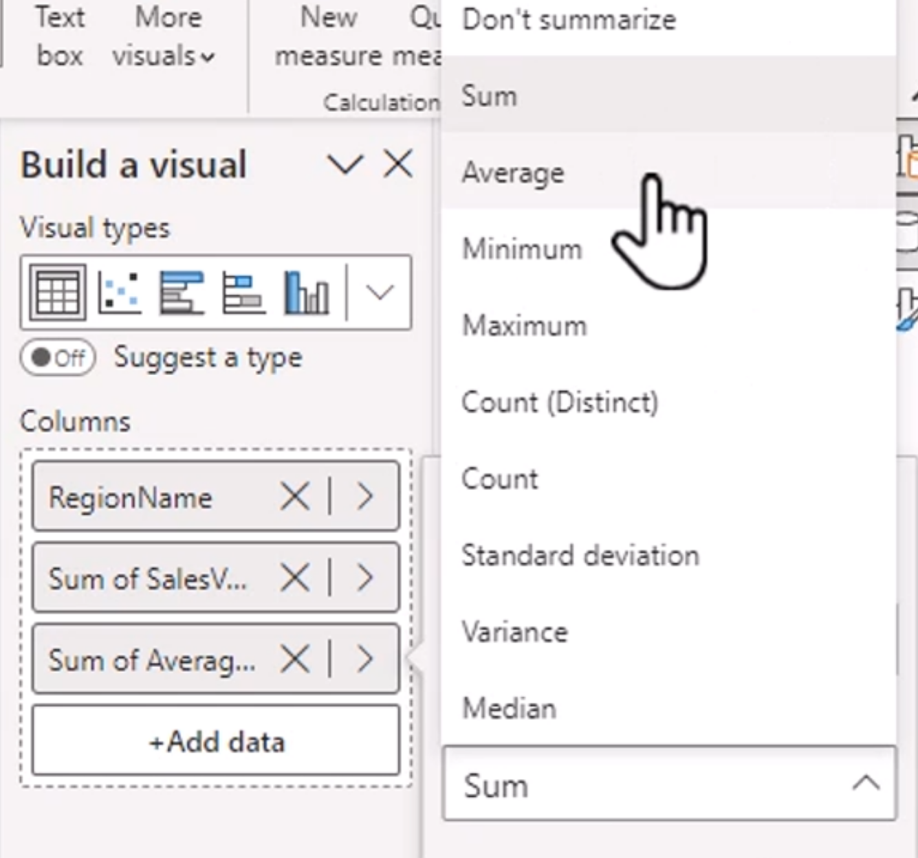
Sum Average Median Standard Deviation Variance
Tip: On the Column tools tab, you can select this by default instead of per visual. It helps with anything titled "Average"
This saves time by being able to drag in one data point and change it for each type you want to show rather than creating new columns or transforming the data another way.
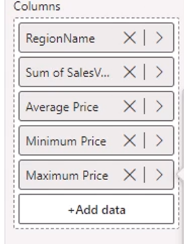
Number and Date Formatting
If you wish to apply a date or number format consistently, you can do this on the column tools tab.
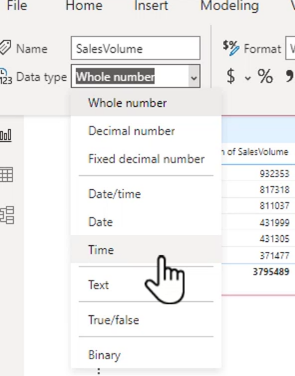
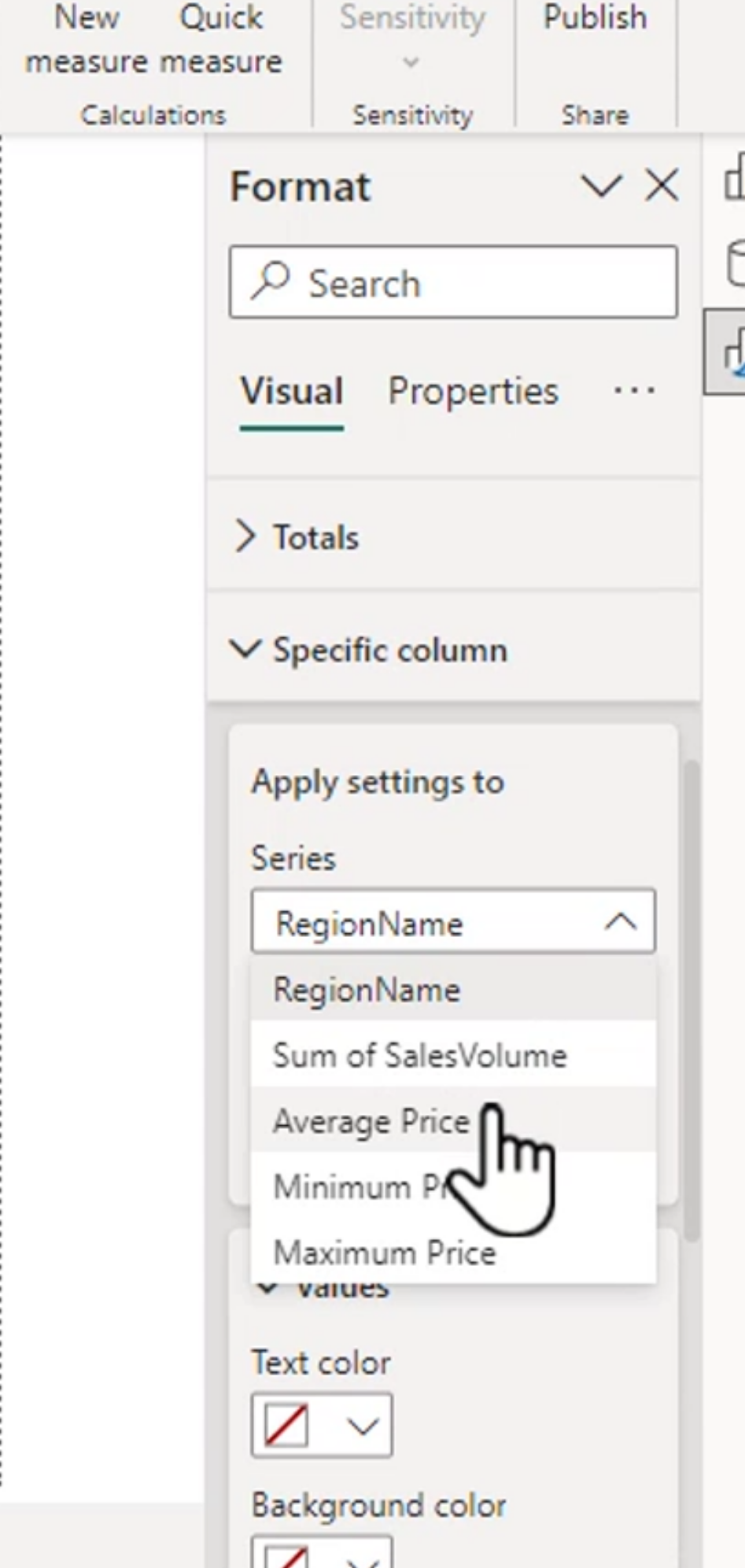
There is an option to override the columns in the formatting pane on the left.
- Select the data point
- Change the options.
Custom number and date formatting
You can put in semicolons into the format field, the first is for all positive, second, negative, third, zeros
For dates, you can select from the dropdown for common, OR do your own using the .....mdy or hour minute second options.
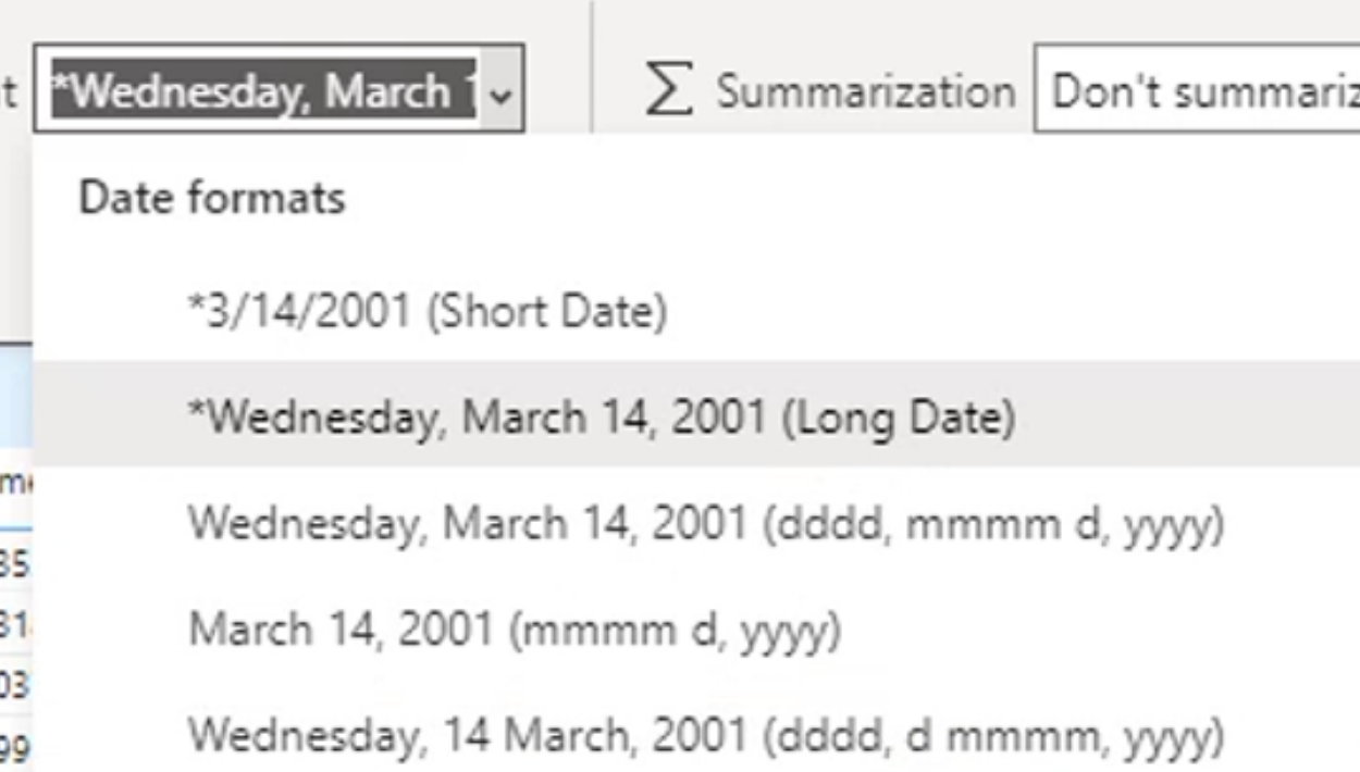
You can also do this in the model tab if you wish.
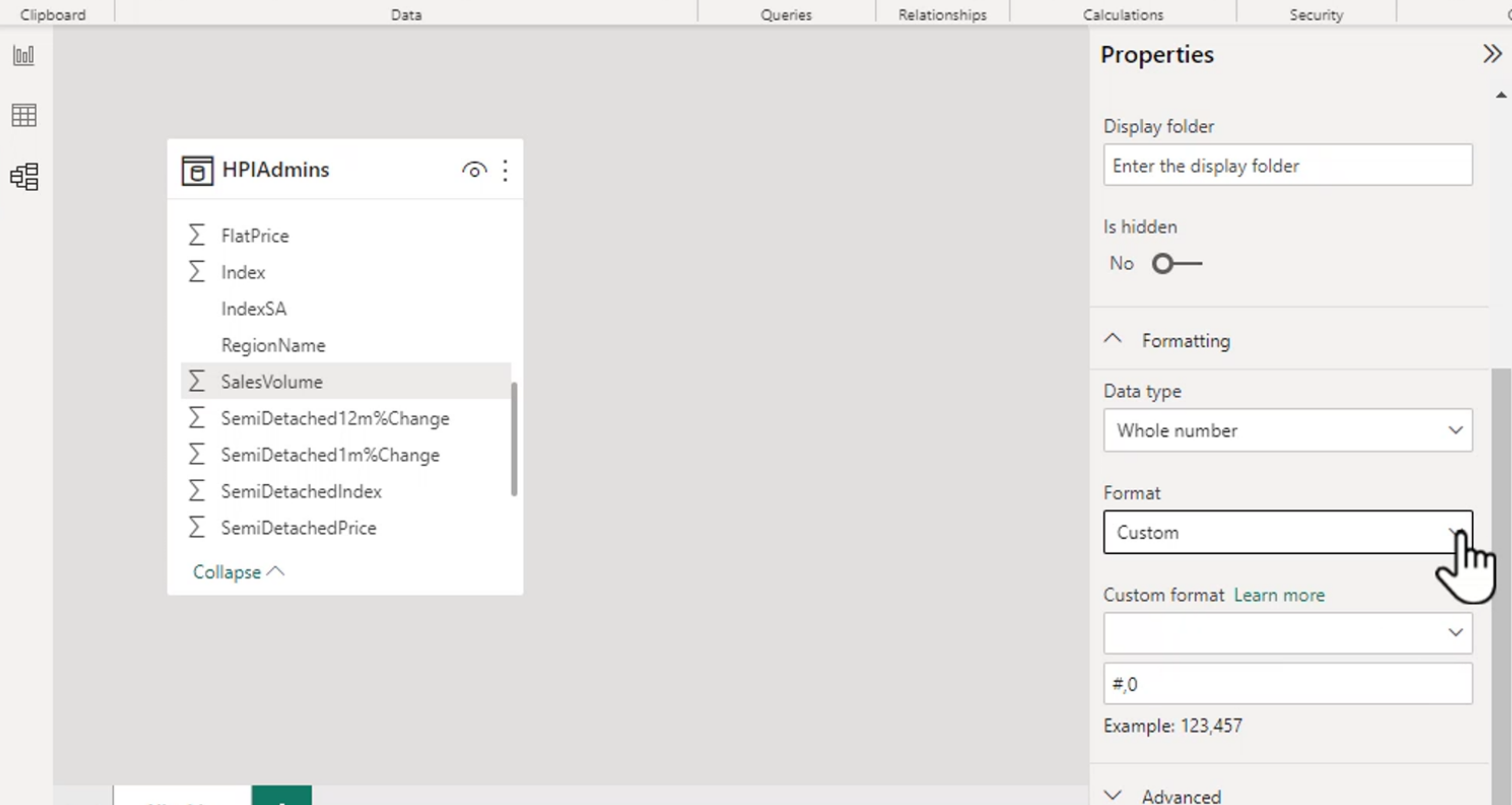
Documentation: https://docs.microsoft.com/en-us/power-bi/create-reports/desktop-custom-format-strings
Visual level formatting
Preview Feature - need to enable Visual Calculations
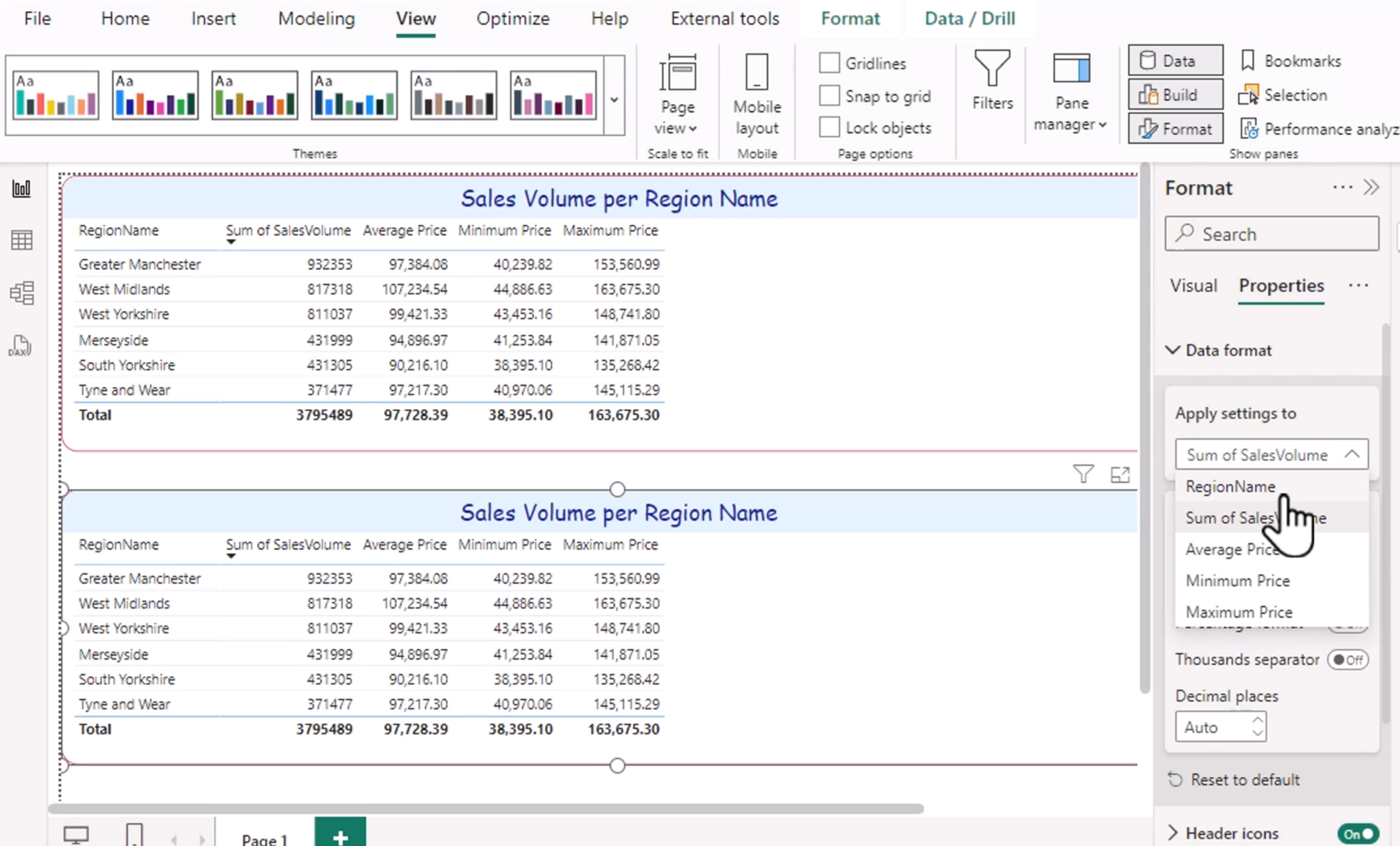
This allows you to format specifically on one visual vs another visual.
Steps:
View -> Select a visual, then properties and then Data Format